An In-Depth Guide And Best Practices For Mobile SEO
Many people don’t know what mobile SEO is and publish their websites without it. This caused them to suffer a huge loss because of Google’s ranking system, which is shown as poor customer service. Secondly, it also causes them to lose sales and increase bounce rate because people prefer mobiles to PCs. This article provides an in-depth guide and best practices for mobile SEO. The following is an in-depth guide for mobile SEO:
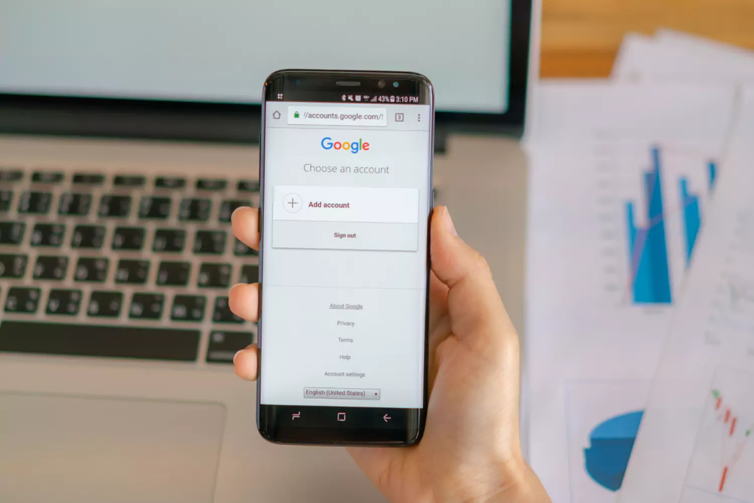
What Is Mobile SEO, And Why Is It Important?
The purpose of mobile SEO is basically to help you gain better visibility and search engines. These are built to have more comfortability for mobile devices. It is one of the main reasons why it was built. It also increases the overall experience that you get from the content and technology. Basically, it makes it easier to explore your website on mobile. Making a mobile-friendly website requires many factors, such as loading speed, because mobile users often get frustrated if the speed is not fast and close the website. Other factors like writing and easy access also matter. This is very important because most of the users of your website are mobile, and if they don’t get what they want, they may abandon you. This way you will lose a lot of sales and profit will be less as people these days only carry mobile phones with them. That’s the reason mobile SEO is very beneficial.
Mobile First Indexing
Mobile-first Indexing is an important principle of Google. It basically means that now your website will also be ranked based on your mobile comfortability. When you apply this phenomenon to your website, you will be ranked higher than usual, as it also affects your website’s overall rating and Indexing. It is very useful if you want to be famous with little effort.
How Much Of Your Traffic Is From Mobile?
The reason the user searches along the keywords about your website (most users prefer desktops to make major purchases) and the site you are working for (for example, desktop users are mainly attracted by B2B sites) greatly determine the degree of traffic potential of your website. Therefore, it is important to keep in mind that your website must be optimised for mobile traffic as well.
It is highly suggested that you focus on optimising your website’s experience for mobile devices instead of focusing on why people are searching for your website’s keywords or on the location and whereabouts of your industry, as this will most likely be the demand in the near future.
You can visit Google Analytics 4 to assess the percentage of the current mobile users and desktop users of your website.
How To Optimise Your Site Mobile-First
Google offers many tools that can help you keep track of all the activities happening on your website, along with its accessibility and performance, which are directly correlated with mobile users and affect them directly. Therefore, it is important to remember that if you use these tools and notice that your website’s statistics are low, you should test them in real time, ideally from a different device, account, and network. If you observe an issue or your website continues with low statistics, immediately work on fixing the problem. If you observe your website giving off a low score, you can use the Pagespeed insights report feature to highlight the factors causing the low score and work on fixing them immediately.
These clues and reports can also help the developers further maintain the website, improve its mobile experience, eliminate bugs or errors and optimise for mobile traffic.
How Important Is It? Will It Really Have An Effect?
If you think this is not very important for your site, hear me out. Most of the traffic, approximately 58 per cent, comes from mobile phones. If you do not provide them with the comfort that they need, you will lose them. Then, you will be only left with a few desktop users checking out your website.
Secondly, as we mentioned above, Google now ranks your website based on the comfort you provide for mobile users. If you give this to them, your ranking will increase, and more people will visit your website.
Lastly, when talking about an effect, as I mentioned above, people will not visit your website if you don’t meet the standards of their needs. Make sure to fulfil their demands to gain more customers, or you will lose sales.
Best Practices For Mobile Optimisation
Following are some tips for mobile optimisation:
Site Rendering
Site rendering is basically how your website responds to different devices. There are 2 types of this term.
Responsive Design:
Responsive design comes first. It essentially works by changing the screen so that, when viewed on a laptop, the text is broader and larger; when accessed on a mobile, it is tiny and tall. The most often used technique among individuals to make their websites mobile-friendly is Google, which also suggests this technique.
Adaptive Design:
The second type of site rendering is adaptive design, also known as dynamic serving. It basically creates different layouts for different devices. To understand better, assume that you create a display for the device the user is using for your website, like different laptops and mobile phones. You get to show users how you want. It is also a very useful method, but responsive design seems to be more accessible and effortless.
Simplified Navigation
Mobile users need easy and intuitive navigation. Use a clean, uncluttered layout with easily tappable buttons and clear calls to action. Implement a sticky menu or hamburger icon to keep navigation accessible without taking up too much screen space.
Fast Loading Times
Satisfy your website to improve user experience and search engine results. Use browser caching, compress images, and minify CSS and JavaScript. Google PageSpeed Insights, among other tools, may point out areas that won’t work.
Touch-Friendly Elements
Ensure that every interactive element is sufficiently sufficiently to be touched, and keep links and buttons sufficiently apart to prevent inadvertent clicks. For navigation and engagement, use touch-friendly gestures to improve usability.
Readable Text
The text should be legible on smaller screens. Use a font size of at least 16px for body text and ensure sufficient contrast between text and background. Avoid long paragraphs; use headings, bullet points, and whitespace to make content scannable.
Conclusion
Mobile SEO is essential to achieve a higher rank and reputation in the eyes of Google and local people. To achieve this, above are some tips and guides for mobile SEO. This way, you can apply it to your website and boost your sales.